07/24/26
November 10, 2009
Redesigning the Worst NFL Helmet Graphics: For the Washington Redskins I tried a design direction that might be considered more politically correct in most circles by removing the Native American portrait, emphasizing the feather motif from the headdress and using it more dynamically on the helmet.
Oh, and while I agree that the New England helmet is hella bland, I think his solution is a little too Evel Knievel.
![]() posted by Joey Michaels at 03:05 PM on November 10, 2009
posted by Joey Michaels at 03:05 PM on November 10, 2009
I'm no graphic designer, but I've always thought the re-branding of the logo and team colors that the Bucs did was one of the most successful and well-done in all of pro sports. The retouched Bucs helmet looks like something more fitting an arena-league team (or the XFL).
The Wash one isn't bad, though. Pretty interesting take on it.
![]() posted by Ufez Jones at 03:14 PM on November 10, 2009
posted by Ufez Jones at 03:14 PM on November 10, 2009
The Washington helmet looks sick! I also dig the Tampa Bay helmet but you're right about the Patriots version, it's a bit too American flag-ish but not bad at all.
![]() posted by BornIcon at 03:15 PM on November 10, 2009
posted by BornIcon at 03:15 PM on November 10, 2009
Pretty sure that Patriots was designed by a freelance artist by the name of Steve Rogers back in the 70s and he wore it on a cross-country motorcycle ride.
![]() posted by yerfatma at 03:21 PM on November 10, 2009
posted by yerfatma at 03:21 PM on November 10, 2009
I guess the general concensus is that the redesign on the Patriots lid does make it look like one is about to blast his Harley Davidson over an expanse of buses. The Bucs didn't need a redesign. And the Washington D.C. football club needs a complete mascot change, not a feathery headdress redesign. The Dolphins need a new logo. That dolphin with the helmet is ridiculous.
As an aside, I am hoping to dispell the misconception that after the Seahawks redesigned their unis the home jerseys were green. They are "steel blue". The green one is this monstrosity. May it never see the light of day again.
![]() posted by THX-1138 at 03:39 PM on November 10, 2009
posted by THX-1138 at 03:39 PM on November 10, 2009
Redskins should change their name to Skins and play without shirts. Maybe they could have clear plastic helmets.
![]() posted by Hugh Janus at 03:57 PM on November 10, 2009
posted by Hugh Janus at 03:57 PM on November 10, 2009
while I agree that the New England helmet is hella bland, I think his solution is a little too Evel Knievel.
I agree. For some reason, when I first saw the redesign, I thought Roller Derby.
![]() posted by graymatters at 04:17 PM on November 10, 2009
posted by graymatters at 04:17 PM on November 10, 2009
Wouldn't the best solution for NE be to go back to the original? One of the best helmets ever, in my opinion.
![]() posted by tahoemoj at 04:25 PM on November 10, 2009
posted by tahoemoj at 04:25 PM on November 10, 2009
I love the redesign of the Redskins helmet. The Patriots redesign is terrible.
![]() posted by Ying Yang Mafia at 04:27 PM on November 10, 2009
posted by Ying Yang Mafia at 04:27 PM on November 10, 2009
Man, I love the Pats redesign. I think we need more Captain America in ... uh, America.
![]() posted by dusted at 05:03 PM on November 10, 2009
posted by dusted at 05:03 PM on November 10, 2009
The Patriots' helmet is plastered with their logo, which comes dangerously close to looking like a wind-swept John Kerry dressed up like a Minute Man.
It does look like John Kerry!
I like the Bucs helmet as it is now. Get close up to it and see how the gold helmet shines under the sun (and I like the logo much better than their original) and you get a new appreciation for it.
![]() posted by dyams at 05:22 PM on November 10, 2009
posted by dyams at 05:22 PM on November 10, 2009
The Patriots redesign is unspeakably atrocious. They'd be the laughingstock of the league with that on their helmet.
![]() posted by rcade at 07:17 PM on November 10, 2009
posted by rcade at 07:17 PM on November 10, 2009
How about The Patriot's redesign their helmets around this iconic moment from a Mel Gibson movie?
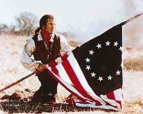
The Bucaneers could use this iconic pirate.
...and if they won't give up the racist name, maybe Washington could pay tribute to another iconic entertainer who dressed like a Native American by wasn't really Native American on their helmet.
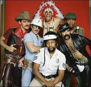
![]() posted by Joey Michaels at 07:41 PM on November 10, 2009
posted by Joey Michaels at 07:41 PM on November 10, 2009
I really liked the redesign of the Tampa bay helmet. The washington helmet was better than what they have now. The new england helmet was ugly.
![]() posted by twgibsr at 10:17 PM on November 10, 2009
posted by twgibsr at 10:17 PM on November 10, 2009
Slightly off topic, the Cleveland Indians logo looks like an extended middle finger to me. Which I think is hilarious.
![]() posted by bobfoot at 01:33 AM on November 11, 2009
posted by bobfoot at 01:33 AM on November 11, 2009
I think I know where he got the Patriots helmet design from. It looks way too much like something Evel Knievel would wear. In fact, here is a pic of Robbie Knievel wearing a very similar looking helmet.
![]() posted by Demophon at 08:03 AM on November 11, 2009
posted by Demophon at 08:03 AM on November 11, 2009
The Pats helmet made me immediately think of this. If they're not going to bring back Pat the Patriot, I say go for it - the NFL needs to lighten up.
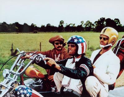
![]() posted by kokaku at 10:27 AM on November 11, 2009
posted by kokaku at 10:27 AM on November 11, 2009
The Washington franchise is going to be renamed the Senate Pages, and from what I hear, a few current and former members of Congress are pushing to have them take the field in lederhosen.
![]() posted by beaverboard at 12:14 PM on November 11, 2009
posted by beaverboard at 12:14 PM on November 11, 2009
...and if they won't give up the racist name, maybe Washington could pay tribute to another iconic entertainer who dressed like a Native American by wasn't really Native American on their helmet.
Just wondering, were the Village People ever called racist, or did they get a bye because they were also gay?
![]() posted by graymatters at 02:43 PM on November 11, 2009
posted by graymatters at 02:43 PM on November 11, 2009
If they weren't ever called that, let me come out and say "totally racist."
The whole idea of having Felipe Rose dressed as a Native American was because the dude who formed the band had this whole "noble savage" fantasy going on. That's one of the most ingrained and sort of loathsome racist images of Native Americans in history.
So, yeah, totally racist.
![]() posted by Joey Michaels at 05:04 PM on November 11, 2009
posted by Joey Michaels at 05:04 PM on November 11, 2009
Also, I know way more about the Village People than I realized. Yikes!
![]() posted by Joey Michaels at 05:04 PM on November 11, 2009
posted by Joey Michaels at 05:04 PM on November 11, 2009
Some idiot graphic "artist" sold the NFL on the new Patriots' design, claiming it was easier to reproduce than the old Pat Patriot logo. Immediately upon its introduction the new logo was derided as "the flying Elvis". This year, with the throwback uniforms being used to celebrate the 50th anniversary of the AFL, Pat is getting a lot more exposure. The commentary is quite favorable, so I say BRING BACK PAT!!!
![]() posted by Howard_T at 05:18 PM on November 11, 2009
posted by Howard_T at 05:18 PM on November 11, 2009
The whole idea of having Felipe Rose dressed as a Native American was because..
Please Joey, for the love of God, please...that was way too much information concerning the damn Village People.
Ugh!
/feels a cold chill run down my spine
![]() posted by BornIcon at 01:48 PM on November 12, 2009
posted by BornIcon at 01:48 PM on November 12, 2009
Just coming here to post this.
In light of their attitude towards their fans, and in light of their insensitivity to charges of racism, allow me to propose that Washington use this as their logo. The bulk of the hand could be on the back of the helmet and the finger could burn straight up the middle.